A new web site for the LibreOffice Project
When we first started the LibreOffice Project, we had a gazilion tasks to work on. Among them, we had priorities, most of them involving the code readiness of our first version, LibreOffice 3.3. Another priority was to make sure that the native-lang communities of the now defunct OpenOffice.org project would be able to find the tools needed to work on the releases, (re)create documentation, QA of their localized builds and several other important tasks. These were some of our most crucial priorities; yet among them, you would not have noted “design a nice website”.
Background
Of course we already had a website -but beyond showing what LibreOffice was about, and presenting what the Document Foundation was about, there was no real reflection. Perhaps more damaging than a lack of in-depth thinking about it, the LibreOffice project had to integrate newcomers early on who ended up having no other interest than imposing the use of one specific CMS platform -and not just for the website, but for pretty much any other community tool. Such an option was the strongest evidence of a complete misunderstanding of community processes, as the LibreOffice project has several online tools used for specific tools (check out a few of them here and there) and keeps on deploying new ones. Long story short – we ended up with a three tiers online presence:
- “user” or “front facing” website : LibreOffice.org and a smaller one specifically for the Document Foundation.
- Wiki, + Communication channels such as mailing lists and IRC
- Online production platforms: Pootle, Moztrap, Gerrit… and a few others.
The first tier, the front facing website was developed by the small website team composed of volunteers who on top of this had other tasks to work on, such as the set up of the wiki, etc. Judging by what we have now, they did a very good job coming up with a proper website. The content was the result of more incremental process. But the content was also, in part of because of a lack of focus or vision, verbose to the extreme, turning what could be a simple page with pointers into a long page of Victorian-age litterature.
Attracting Users and Growing the Community
After a few years, the limitations of the website became obvious. Perhaps more evident was the absolute lack of messaging coherence and focus. We had a standard presentation of the office suite applications; we also had a “Why” page, a concept of inherited from the old days of OpenOffice.org ; but this page was not actually accessible from the menus until you knew its exact URL; and the detailed information on it blurred the frontier with the wiki where you can pretty much find all the content of the website, only three times more detailed. As a result, you could not really tell what was special about LibreOffice until you would be reading pages and pages of text on a website. By the time we released the 4.0, new volunteers worked on a set of additional pages initially made for the release of the 4.0 that aimed to give the website a more attractive and synthetic look, announcing the 4.0 release and presenting the most salient features in an attractive way.
But this new set of pages was a temporary solution as we needed to completely redesign the website. We started with three initial points:
- keeping the initial base: we sticked to SilverStripe, this time in the 3.0 version
- we need a really attractive messaging, a simpler and quicker way for people to learn about LibreOffice
- we want to use this website to attract potential contributors and grow our community.
The Making-Off
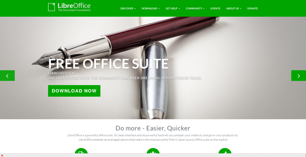
Given the amount of work that was needed the Document Foundation decided that to fund this effort. Part of it was the selection for a graphics designer. Our first surprise was that the candidates were for the most part not contributors of the LibreOffice project, but professionals who had heard our call online. We ended up picking the only Italian among the candidates, and we are very pleased with our choice. Eleonora Anzini has been working with me and Christian Lohmaier to develop this website in a relatively short time. In less than three months the specs and sketches were drafted by yours truly, published, feedback collected, a new instance of Silverstripe created so the website was ready to be developed. You can see the result today:
The hurdles we faced were, among other things the complexity of the SilverStripe CMS, which is quite powerful and very effective. It becomes rather complex however for special views and pages creation, although it is very easy to use for daily maintenance and content edition. The other hurdle -although it’s more a challenge than a real difficulty, was the relatively low input from the community. When we showed the website in its staging area -where it still is at the moment I’m writing the blog – most of the people actually discovered it, despite having been presented with specification documents, specs and asked all sorts of questions for several weeks. Granted the URL was not public, but some of remarks clearly came from people who had never even taken a look at the plans. At the very least, growing our community seems like a goal we must achieve, and improving our internal communications and marketing is actually going to be part of that.
Beauty & Style
I do not pretend I can create beauty and style on a website with a snap of the fingers, nor would I claim that I have great taste. But I know what’s bad taste, and I know when it’s time to get serious on style. Many Free and Open Source projects have trouble coming up with beautiful presentations and website; while ours was not bad, it could really be improved given the size and standing of the LibreOffice project. This time, we really tried to achieve just that: beauty, style, but also clarity, simple and appealing information bits, easy access, and lots of pointers to our community platforms and online tools. And while we did not focus too much on screenshots (surprisingly, not a lot of software websites have these) we tried to be really creative with getting to the point and getting our message through with nice and appealing images. So far we have some great feedback and we’re very happy about this. Next week (very likely) the website will be upgraded and enter in production. It’s been weeks of hard work but we’re proud of presenting you this new website, designed in Italy, written and planned in France, forged in Germany… and made for everyone.
Leave a Reply