The subtle art of the Desktop
The history of the Gnome and KDE desktops go a long way back and their competition, for the lack of a better term, is almost as famous in some circles as the religious divide between Emacs and Vi. But is that competition stil relevant in 2016? Are there notable differences between Gnome and KDE that would position each other on a specific segment of users? Having both desktops running on my systems (workstation + laptop) but using really only one of them at all times, I wanted to find out by myself.
My workstation and laptop both run ArchLinux, which means I tend to run the latest stable versions of pretty much any desktop software. I will thus be considering the latest stable versions from Gnome and KDE in this post. Historically, the two environments stem from different technical platforms: Gnome relies on the GTK framework while KDE, or more exactly the Plasma desktop environment, relies on Qt. For a long time, that is until well into the development of the Gnome 3.x platform, the major difference was not just technical, it was one of style and experience. KDE used to offer a desktop experience that was built along the lines of Windows, with a start center on the bottom left, a customizable side bar, and desktop widgets. Gnome had its two bars on the top and bottom of the screen, and was seemingly used as the basis for the first design of Mac OS X, with the top bar offering features that were later found in the Apple operating system.
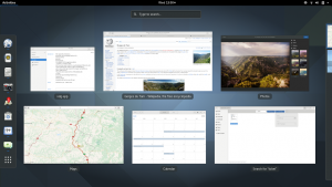
This started to change, however, when the Gnome Shell started to mature. Not only did Gnome attempt to offer a similar experience across devices, it did change the way the whole desktop felt and worked. The Gnome project did something else too: instead of relying on an ecosystem of software applications that could take advantage of its own platform (native or cross platform applications) it did embark into a conscious effort to design and develop native and fully integrated software packages that complemented the basic desktop experience. Of course, that notion was always around: KDE had Kmail, and then Kontact and Konqueror; Gnome has  Evolution, as well as Galeon, Epiphany and now Gnome Web as the default browser. Users may of course select other software as their default choice. But Gnome went a bit farther: new projects were created to offer a streamlined experience within a purely Gnome environment: Gnome Photos, Gnome Music, Gnome Maps, Gnome Documents, Gnome Calendar, Gnome Contact… not everyone of these initiatives has reached a state of maturity or feature partity with other software that enjoy a broader use base, but the intended result is quite impressive. The real question, of course, is whether the community of developers will be able to deliver on all of these applications.
There is an irony of History when it comes to the Gnome Desktop Environment, as its concepts were used to create the OS X desktop experience, and not the other way around. Now it’s up to the Gnome project to reuse OS X’s concept of native applications: iCal, iContacts, iMaps, etc. to offer an improved experience to its users.
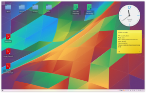
When it comes to KDE, I have to admit that I never was a fan of its experience. It felt too much like Windows to me, although some of the applications that ship with the KDE stack are still among my favourites: the almighty Okular document viewer, Gwenview, Kgpg… A special mention must be made  for Kontact, which probably sports the most feature complete groupware client I can think of – but having never been muh of a KDE user and not enjoying Akonadi all that much, I sticked to Claws-Mail and Evolution for a long time before moving a major part of it to Emacs’ mu4e. The ambitious concept with KDE and with its ultimate offspring, Plasma, is that the desktop environment should be aware of your data and should make it available to you whenever you need it. That is notably done with Akonadi; some people enjoy it, I always had trouble with it. But be it as it may, the Plasma experience is one that is one of the most aesthetic one to this day and in my (subjective) opinion surpasses the Windows and OS X ones. Everything from the icons to the desktop itself has been carefully designed and planned to ensure some actual “wow” moments. Faithful to the KDE way of doing things, the Plasma desktop is entirely customizable (something not easily possible with Gnome Shell). The way it feels is actually amazing. For the first time I’m experiencing a desktop environment from the KDE project that feels both smooth, beautiful and logical. I have to say it was not always the case before from my perspective. Kudos to the developers!
Which one of the two desktops is best? I cannot really answer that, as my answer would be entirely subjective. What I can suggest, however, is that these two desktops offer experiences that are tailored for different kinds of people. If you are looking for an integrated, hassle-free desktop experience, then Gnome is for you. If you are looking to customize your environment, I believe Plasma should be the right choice.
In both cases and in many ways, developing a desktop environment and taking into account the users’ input is definitely difficult. It is a subtle art, and one that has been mastered by both the Gnome and KDE projects, albeit in different ways.

Leave a Reply