
It’s official, MS Office looks like The Gimp.
Taken from the GullFOSS blog, Andreas Mertel’s post, this is how MS Office 2008 on Mac OS X may look like, if you don’t pay enough attention:
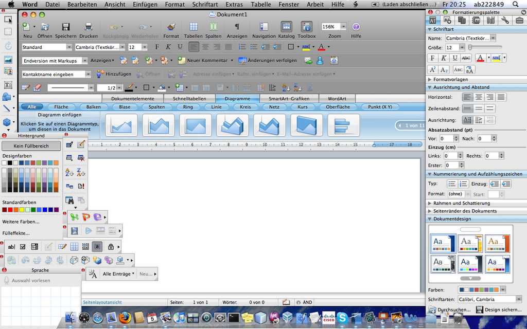
Now this is, after 5 minutes of fiddling with pretty much every toolbar possible, how OpenOffice.org 3.01 looks on my Fedora 10:

To be fair, we should perhaps salute the man/years of development that have been put into both office suites first and then criticize them if we want to. But still, Andreas makes an interesting point: This is how you can render an application unusable when you work along the lines of “more is always better”.
Enjoy your Sunday!
Leave a Reply